Tuesday, December 10, 2013

ISO, Aperture, and shutter speed


1. What part of the body should we closely relate aperture? 

 The eye.
2.The smaller the Aperture the larger the lens, the higher the Aperture the smaller the lens
3. Aperture impacts depth of field because it could either be blurry or sharp.

F2.8
F16

high shutter speed
low shutter speed
a) dunking booth- fast
b) the food eating contest- fast
c) the rock climbing wall- slow
d) someone working at a booth- slow
e) the dj working at the middle of the circle- slow
f) diamonds performance- fast
nightime 
a) dunking booth- slow
b) the food eating contest slow
c) the rock climbing wall- medium 
d) someone working at a booth- slow
e) the dj in the middle of the circle- medium
f) diamonds performance- medium
ISO 200

ISO 3200
1. ISO captures fast shots of people or things doing quick actions. 
2. "You should always use the lowest ISO, to retain the most detail and to have the highest quality image. 
3. If you set your ISO really high you'll freeze motion. 

Caption writing: 5 Ws and H

Albert Einstein sticks his tongue out for a quick shot on March 14, 1951 inside his car for a photograph
 Lee harvey Oswald is shot outside a courthouse on November 24, 1963 for killing John F Kennedy on live television
Children are escorted from school on December 14, 2012 after Adam Lanza shot and kill 26 students and staff members in Sandy Hook Elementary school. 

The Hindenburg blimp crashes in 1937, killing 36 people.

George mendonsa joyfully kisses random stranger Greta Friedman after world was II ended.

Wednesday, October 23, 2013

Great black and white photographers part 3

What caught my attention on this photograph is that Frida Kahlo is posing normally, but we all know that she's really famous, so I chose this photograph. If I was in Frida Kahlo's point of view I would see the photographer. I would smell maybe food since she's having a guest over? I would hear the shutter sound of the camera taking the picture. I would taste the food I am cooking because I might be hungry. I would feel the furniture on my elbow. 

What caught my attention on this photograph is the murder scene. Im interested in real life deaths, I have no idea why. I find it fascinating, and I liked this photo because its real. Honestly, if I was in the guys position, I WONT BE ABLE TO TASTE, HEAR, SEE, FEEL, OR SMELL. But lets just say I could. I would taste blood since there is blood on the persons face. I would hear people screaming or police/ambulance sirens. I would smell my own blood since its on my nose too. I would feel the pain going on everywhere, and maybe people helping me up and such. I would see people freaking out around me and helping me up. 

I would probably make power points for the two photographers since I can show different photographs of the two photographers they have taken. I can present their awards they have received if they did or not. I can present their life and their point of views of everything, good or bad. 

Monday, October 21, 2013

Africa: Black and white

I really liked the Africa photographs. I like how they're not amateur taken and they seem really neat and professional in a way. I like how its black and white, its makes it look more majestic.
This is my favorite photograph because I think Gorillas are really gnarly. It reminds me of a movie I loved to watch when I was younger. I also love how this looks like a painting, but its a photograph. I think the only rule of photography evident is framing. Im not sure if thats correct or not. Im assuming the wildlife/forrest is surrounding the Gorilla. He uses a Pentax 67ll. Nick Brandt took the photos because the world is under terrible threat. He believes every human or nonhuman has the right to live, and he feels that every living thing is equal. He wants to appreciate the animals and their beauty before they are gone. People take pictures of themselves and other unimportant things, but they won't focus on Animals. "Brandt fell in love with the animals and land of East Africa".

Thursday, October 17, 2013

Academics Shoot Reflection

The challenges I faced when taking these pictures is forgetting the categories I was supposed to be focused on. I also forgot that these were about academics. I took pictures outside a classroom than in a classroom. I was really focused on taking pictures good. I tried to focus the camera to the object or person I was shooting for before I took a picture. I learned my lesson from the beginning of the year. If I had the assignment again, I could focus on the academics more, like I can take a picture of a calculator on a desk for simplicity. I would keep the "non-blurryness" the same. I took good focused photographs. The easiest rule to achieve will probably be simplicity. Its not that hard. It depends though. Balance or framing will probably be the hardest. Im not too sure on Balance. I think I'm having the wrong idea for it. Im gonna find out soon so I will be aware of it.

Tuesday, October 15, 2013

Academics Shoot

Rule of Thirds-
I followed the rule somewhat. The lady isn't in one of the tic tac toe points, but she's the only person in the photograph. It might be clear to people what the subject is, they might say its simplicity. I didn't follow the rule that much because she's not in one of those points, but its not so bad. The subject is the woman, she is looking directly at the camera, and the viewer can make eye connection with her. 
Avoiding Mergers-
This is kinda Avoiding Mergers. The boy next to the girl reading her book is sitting up, which makes the girl have another body. The photograph isn't really clear to people what the subject is. I don't know what else they could say, but this is hard. the subject is focused on the two students, binding into each other. I kinda did follow the rule on this photograph.
Framing-
This is somewhat framing. The poles surround the man with the hose. I somewhat followed the rule, I think I did. People will probably agree that this is framing, but some might not. The subject is based on the man. The framing is the poles and the man is in the middle of them. I could've improved if i got closer to avoid the school and the brick wall. 
Lines-
I didn't follow the rule for this. This isn't academics. I could've improved by that, and by at least zooming into the lines on the rail. People can probably tell what this is. The subject is the rail, having lines for the category. I could've done better on this.
I followed the rule for this one. But this isn't academics. The subject is the squished pair. there is a solid background, and you notice the pair first. People can tell what category this would be. I did do a good job, but I had to do academics. 

I didn't really follow the rule on this category. I forgot about balance. The lockers kinda are the same height so they sorta balance. I could've improved on this because once again, this isn't balance. Students might get what category this would be. The subject are the lockers, they're all the same height and people can tell that.


Wednesday, October 2, 2013

Academics Shoot Preview

The Story-
The story behind this I'm assuming is that there is still hope in humanity. The high schoolers are feeding the homeless, rather than adults would. Teens are doing good at a young age, and that brings hope to me in people.
Action and Emotion-
You can see the emotion on the two teenage girls that they are surprised. They were probably doing an experiment, and the girl on the right seems happy. They're having a good time.
Filling the frame- 
I found this photograph the most interest because it consists of myself that I try hard in school to pass my classes. The interesting this also is the student's facial expression. You can't tell if she is really concentrated on her work, or if she is really tired. Maybe both.
I picked this photograph because I like how the two different beakers make one color. I find it interesting. Balance is somewhat used, colors also. 


Monday, September 30, 2013

Avoiding Mergers

This falls on the Avoiding Mergers part because of the flowers. The flowers looks like it goes through the man with the suitcase and so it looks like he somehow got stabbed. 

Framing

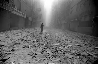
This photograph matches with the framing category because the window is around the flag and the fallen twin towers. It basically points out the flag.

Balance

This photograph matches with balance because the twin towers are exactly the same height and some of the other buildings are around the same level of height, but not exactly the same. 

Lines

I chose this photograph for lines because there are cables and the buildings can count as lines too... right? there are also lines with the windows of the building.

Rule of Thirds

I chose this photograph as The Rule of Thirds because the man is in one of the points the rule of thirds would be. Or is that a woman.. Either way its in a good position.
Simplicity

                                                                        Simplicity-
I chose this photograph for simplicity because it only shows the spray paint on the ground and nothing else. Its simple, but nice.


Thursday, September 26, 2013

Elements of Art and Principles of Design

Line-  Lines are marks made by a pointed tool: brush, pencil, pen, etc. Lines can vary in width, direction, curvature, length, or color.
Shape- Shapes are formed wherever the ends of a continuous line meet. Geometric shapes such as circles, triangles or squares have perfect, uniform measurements and don't often appear in nature. Organic shapes are associated with things from the natural world, like plants and animals.
Color- Color wheels show the primary colors, secondary colors, and the tertiary (intermediate) colors. They also show the relationships between complementary colors across from each other, such as blue and orange; and analogous (similar or related) colors next to each other such as yellow, green, and blue. Black and white may be thought of as colors but, in fact, they are not. White light is the presence of all color; black is the absence of reflected light and therefore the absence of color.
Value (Tone)- Value, or tone, refers to dark and light; the value scale refers to black and white with all gradations of gray in between.  Value contrasts help us to see and understand a two-dimensional work of art.
Form- Form describes objects that are three-dimensional, having length, width, and height.
Texture- Texture can be rough, bumpy, slick, scratchy, smooth, silky, soft, prickly--the list is endless.  Texture refers to the surface quality, both simulated and actual, of artwork.

Space- Space refers to distances or areas around, between, or within components of a piece. Space can be positive (white or light) or  negative (black or dark), open or closed,shallow or deep, and two-dimensional or three-dimensional. 
Balance- Balance is the comfortable or pleasing arrangement of things in art.  There are three different types of balance: symmetrical, asymmetrical, and radial. The human figure is symmetrically balanced; the same on the left and right side. The tree is asymmetrically balanced; its branches are not distributed equally on each side, but their total weight is balanced left and right. The sun is an example of radial balance; all its rays are equal in length from the center.
Contrast- Contrast is created by using elements that conflict with one another. Often, contrast is created using complementary colors or extremely light and dark values. Contrast creates interest in a piece and often draws the eye to certain areas. It is used to make a painting look interesting.
Emphasis- Emphasis in the focal area of an artwork gives it importance.  An artist may stress some elements of the design over others. The eye of the viewer will focus on the area of emphasis or center of interest first, then take in the rest of the composition. 
Movement- Movement in an artwork means the artist is taking viewers on a trip through the work by means of lines, edges, shapes, and colors often leading to the focal area.  Movement is a visual flow through the composition. It can be the suggestion of motion in a design as you move from object to object by way of placement and position.  Directional movement can be created with a value pattern. It is with the placement of dark and light areas that you can move your attention through the format.
Pattern- Patterns are made in art when the same shapes or elements are repeated again and again.  Pattern uses the elements of art in planned or random repetitions to enhance surfaces of paintings or sculptures.
Rhythm- Rhythm is the repetition of shapes, lines, and forms.  Rhythm is a movement in which some elements recurs regularly.  Like a dance, it will have a flow of objects that will seem to be like the beat of music.
Unity- Unity means that all elements in an artwork are in harmony.  Unity brings together a composition with similar units.  For example, if your composition was using wavy lines and organic shapes you would stay with those types of lines and not put in even one geometric shape.
                                                                          Line- 
I chose these photographs because the art has the Tiki looking these pointed out in lines. The photograph has a zebra next to bamboo, and they're all in a straight line. 
Shape-
I chose these two for shape because the drawing has a man holding a sphere with his reflection. The sphere is a shape. The pear has a heart in the middle. I might be wrong but I believe a heart is a shape. I was told it was in elementary school. 
Color- 
The art is in the color category because it has different kinds of colors. The photograph also has colors inside the bottles, which I also believe falls under the color category.
Value- 
I chose the flower for value because it has different shades of the flower. I have also noticed that the drawing in the bottom is not a photograph, but I don't want to change it because my hand hurts for typing a lot. First world problems, I know. The art on the bottom also has different shades of blue and green for the pine trees and grass.  
Form- 
The drawing of Form looks realistic and falls under the form category because of its three dimensional forms. The photograph on the bottom has three dimensional shapes so its into the form category.
Texture-
The drawing for texture looks like its rough because since it was in a cave, you can infer how rough rock is. The moss on the tree makes you kind of feel how it would feel. That sounded weird, I apologize for my poor use of vocabulary. 
Space- 
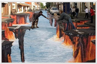
The space for the art is in between the fingers of both people. It also has space around them. The space for the photograph is in the sky. The universe is infinite, so there is a lot of space, also around the electrical wires.
Balance-
The balance on the pitchfork on the art is what I wanted to point out. The balance on the height of the flowers also. They seem to all be the exact same height. 
Contrast-
Mona Lisa has contrast in the background and on her shadow. The photograph has somewhat contrast also. 
Emphasis- 
The emphasis on the art is on inside the dinner. It points out how modern life is. The photograph is a part of emphasis because it focuses on the leaf. 
Movement- 
The movement is present on the art because of the facial expressions the people are giving, so you follow whats happening next. The photograph has movement because of the flow of the water.
Pattern- 
Andy Warhol's campbell's soup has pattern because it just repeats itself many times. The same thing with the photograph, the signs on the road also repeat itself many times. 
Rhythm-
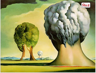
The art has rhythm because of the head shaped figure and the tree and the following head shape figure. it keeps repeating in different ways. The photograph also has Rhythm with the lights. It flows on and on. 
Unity-
The art shows the unity of the people. They're all together. The unity is also present in the zebras because they have the same reaction and they're also together.