Monday, September 30, 2013

Avoiding Mergers

This falls on the Avoiding Mergers part because of the flowers. The flowers looks like it goes through the man with the suitcase and so it looks like he somehow got stabbed. 

Framing

This photograph matches with the framing category because the window is around the flag and the fallen twin towers. It basically points out the flag.

Balance

This photograph matches with balance because the twin towers are exactly the same height and some of the other buildings are around the same level of height, but not exactly the same. 

Lines

I chose this photograph for lines because there are cables and the buildings can count as lines too... right? there are also lines with the windows of the building.

Rule of Thirds

I chose this photograph as The Rule of Thirds because the man is in one of the points the rule of thirds would be. Or is that a woman.. Either way its in a good position.

Simplicity

                                                                        Simplicity-
I chose this photograph for simplicity because it only shows the spray paint on the ground and nothing else. Its simple, but nice.


Thursday, September 26, 2013

Elements of Art and Principles of Design

Line-  Lines are marks made by a pointed tool: brush, pencil, pen, etc. Lines can vary in width, direction, curvature, length, or color.
Shape- Shapes are formed wherever the ends of a continuous line meet. Geometric shapes such as circles, triangles or squares have perfect, uniform measurements and don't often appear in nature. Organic shapes are associated with things from the natural world, like plants and animals.
Color- Color wheels show the primary colors, secondary colors, and the tertiary (intermediate) colors. They also show the relationships between complementary colors across from each other, such as blue and orange; and analogous (similar or related) colors next to each other such as yellow, green, and blue. Black and white may be thought of as colors but, in fact, they are not. White light is the presence of all color; black is the absence of reflected light and therefore the absence of color.
Value (Tone)- Value, or tone, refers to dark and light; the value scale refers to black and white with all gradations of gray in between.  Value contrasts help us to see and understand a two-dimensional work of art.
Form- Form describes objects that are three-dimensional, having length, width, and height.
Texture- Texture can be rough, bumpy, slick, scratchy, smooth, silky, soft, prickly--the list is endless.  Texture refers to the surface quality, both simulated and actual, of artwork.

Space- Space refers to distances or areas around, between, or within components of a piece. Space can be positive (white or light) or  negative (black or dark), open or closed,shallow or deep, and two-dimensional or three-dimensional. 
Balance- Balance is the comfortable or pleasing arrangement of things in art.  There are three different types of balance: symmetrical, asymmetrical, and radial. The human figure is symmetrically balanced; the same on the left and right side. The tree is asymmetrically balanced; its branches are not distributed equally on each side, but their total weight is balanced left and right. The sun is an example of radial balance; all its rays are equal in length from the center.
Contrast- Contrast is created by using elements that conflict with one another. Often, contrast is created using complementary colors or extremely light and dark values. Contrast creates interest in a piece and often draws the eye to certain areas. It is used to make a painting look interesting.
Emphasis- Emphasis in the focal area of an artwork gives it importance.  An artist may stress some elements of the design over others. The eye of the viewer will focus on the area of emphasis or center of interest first, then take in the rest of the composition. 
Movement- Movement in an artwork means the artist is taking viewers on a trip through the work by means of lines, edges, shapes, and colors often leading to the focal area.  Movement is a visual flow through the composition. It can be the suggestion of motion in a design as you move from object to object by way of placement and position.  Directional movement can be created with a value pattern. It is with the placement of dark and light areas that you can move your attention through the format.
Pattern- Patterns are made in art when the same shapes or elements are repeated again and again.  Pattern uses the elements of art in planned or random repetitions to enhance surfaces of paintings or sculptures.
Rhythm- Rhythm is the repetition of shapes, lines, and forms.  Rhythm is a movement in which some elements recurs regularly.  Like a dance, it will have a flow of objects that will seem to be like the beat of music.
Unity- Unity means that all elements in an artwork are in harmony.  Unity brings together a composition with similar units.  For example, if your composition was using wavy lines and organic shapes you would stay with those types of lines and not put in even one geometric shape.
                                                                          Line- 
I chose these photographs because the art has the Tiki looking these pointed out in lines. The photograph has a zebra next to bamboo, and they're all in a straight line. 
Shape-
I chose these two for shape because the drawing has a man holding a sphere with his reflection. The sphere is a shape. The pear has a heart in the middle. I might be wrong but I believe a heart is a shape. I was told it was in elementary school. 
Color- 
The art is in the color category because it has different kinds of colors. The photograph also has colors inside the bottles, which I also believe falls under the color category.
Value- 
I chose the flower for value because it has different shades of the flower. I have also noticed that the drawing in the bottom is not a photograph, but I don't want to change it because my hand hurts for typing a lot. First world problems, I know. The art on the bottom also has different shades of blue and green for the pine trees and grass.  
Form- 
The drawing of Form looks realistic and falls under the form category because of its three dimensional forms. The photograph on the bottom has three dimensional shapes so its into the form category.
Texture-
The drawing for texture looks like its rough because since it was in a cave, you can infer how rough rock is. The moss on the tree makes you kind of feel how it would feel. That sounded weird, I apologize for my poor use of vocabulary. 
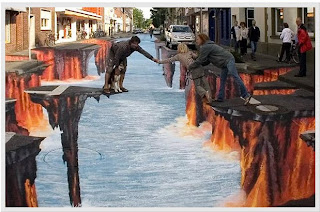
Space- 
The space for the art is in between the fingers of both people. It also has space around them. The space for the photograph is in the sky. The universe is infinite, so there is a lot of space, also around the electrical wires.
Balance-
The balance on the pitchfork on the art is what I wanted to point out. The balance on the height of the flowers also. They seem to all be the exact same height. 
Contrast-
Mona Lisa has contrast in the background and on her shadow. The photograph has somewhat contrast also. 
Emphasis- 
The emphasis on the art is on inside the dinner. It points out how modern life is. The photograph is a part of emphasis because it focuses on the leaf. 
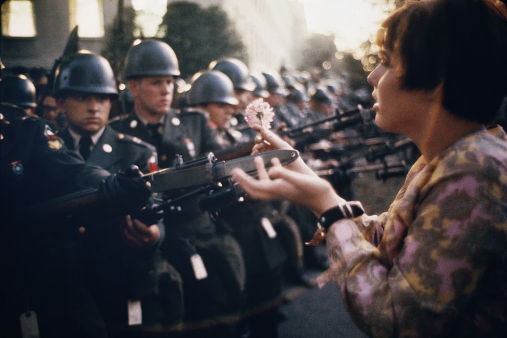
Movement- 
The movement is present on the art because of the facial expressions the people are giving, so you follow whats happening next. The photograph has movement because of the flow of the water.
Pattern- 
Andy Warhol's campbell's soup has pattern because it just repeats itself many times. The same thing with the photograph, the signs on the road also repeat itself many times. 
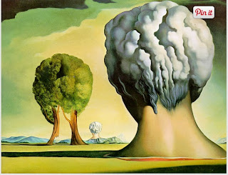
Rhythm-
The art has rhythm because of the head shaped figure and the tree and the following head shape figure. it keeps repeating in different ways. The photograph also has Rhythm with the lights. It flows on and on. 
Unity-
The art shows the unity of the people. They're all together. The unity is also present in the zebras because they have the same reaction and they're also together.

Friday, September 20, 2013

Photo manipulation and ethics

http://www.globaljournalist.org/stories/2009/07/01/ethics-in-the-age-of-digital-manipulation/

The website shows four different photoshopped photographs, and gives examples of good use of photoshop, and bad use of photoshop. The man on the Prudhoe Bay oil field, shows a good example, because the original photograph messed up, and gave the man four hands accidentally. The photoshopped photograph fixed the photograph and made it look like it was normal. A bad example is how an official photo for Jerusalem had been photoshopped to edit the females out, so it only there is only males.
I think this photograph is the most unethical because it appears to have the soldier yelling at the man with the child, but it was photoshopped, and the truth is that the soldier allowed the man to come forth to see what was wrong. I think.
This photograph isn't as unethical as the others because it isn't really doing any harm to anybody, and also, it helps the magazine because the book is so thin, so they edited the pyramids for the benefit of the magazine, without doing harm to others.

40 Greatest Photos Ever

What made me pick this photo, is that John F. Kennedy Jr, is saluting his fathers coffin, during his memorial, and it makes me feel sorry for him, because he lost his father at such a young age. What got my attention on this photo is that the picture is set to John F. Kennedy Jr because of him also saluting his father like the honor guards. The photo probably made the cut to the Top 40th photographs because of how a child salutes his own father's coffin at such a young age. This is my favorite photograph.
What made me choose this photograph, is that I am really against war. I don't find any use to it, and Im not trying to sound like a Hippie, but I would rather want world peace, over world wars. What got my attention is that the woman places a nice looking flower on a soldiers bayonet. This photo must of made the cut for the 40th photographs because of how this is so anti-war like and that is good. It also has some kind of impact towards me by the way the photograph has its lighting I guess. It looks really good but I can't really tell what it is.
This is one of my favorite photographs because I really feel bad for 9/11, I feel bad for everyone that lost their lives, for the children that lost their parents, and for the parents that lost their son or daughter in the world trade center. I used to not really care about 9/11 because it didn't concern me, but now I really feel sorry for everyone and for the country being attacked by terrorist. What got my attention is that the father pauses and kneels to his sons name. This photo made the cut probably because the people that weren't affected by 9/11, really don't know how it feels to have someone taken away from you unexpectedly.

Wednesday, September 18, 2013

Great black and white photographers part 2


Manuel Alvarez Bravo was born in Mexico City on February 4, 1902. He took art classes at the Academy of San Carlos. He won numerous awards for his work, mostly after 1970. He worked as a clerk at a French tile factory for a time, and later at the Mexican Treasury Department. He died on October 19, 2002, in Mexico City.

Post shoot reflection

http://hazelsphotojournalismblog.blogspot.com/
Hazel Rodriguez

Positive:
1. All of the pictures are well taken. They were clear and easy to see and tell what it was about
2. None of them were blurry or ugly. They weren't blurry (like mine were) so thats good.

Negative:
3. You could've focused in more or zoomed in.

National Geographic Warm up

 This is my favorite photo because it looks like it is edited or photoshop, but it actually is a real life event. I also like it because of how the lighting is mixed with a volcanic eruption. It all looks so majestic. The scenery is good and so is the photograph. If I were to enter this contest I would probably take a picture of something war related.

Monday, September 16, 2013

Red, Metal, and Happy

                                                                            Red
Metal
Happy 

Tuesday, September 10, 2013

Camera History

1. The effect came to be known as the "camera obscura" is Latin for "dark room". This was the first camera. The hole acted like a lens, focusing and projecting light onto the wall of the dark chamber. 
2. In the 17th century, the modern camera came one step closer when Isaac Newton and Christian Huygens perfected the understanding of optics and the process of making high quality glass lenses.
3. A glass lens, a dark box, and film.
4. Light passes through the lens, into the camera, and exposes the film. The end result is still a photograph.
5. They use an electronic sensor called CCD. 
6. The fully automatic (A)uto or (P)rogram mode is the default for most modern cameras. The photographer can simply aim, press the button, and almost be guaranteed a great image.
7. Portrait mode will blur out the background, and the camera will try to use the fastest available lens setting.
8. Sports mode is to freeze motion. The camera will use the highest shutter speed possible. 
9. The half pressed button is helpful in many ways, including faster camera response time, more control over focus, encourages better composition.
10. The symbol means "no flash". There are many cases where you may not want flash at all. The mood of the photograph can sometimes be more dramatic when the natural light is used.
11. The symbol means "auto flash". In most camera modes, Auto-flash is enabled by default and will automatically fire if the camera thinks it needs more light.
12. If there is too much light, the picture will be washed out.
13. If there is not enough light, the picture will be too dark. 
14. The term "stop" is used in every aspect of photography to represent a relative change in the brightness of light. 
15. 1 stop brighter 
16. 2 stops brighter.
17. A longer shutter speed has more light.
18. A shorter shutter speed has less light. 
19. Before light reaches film, it must pass through an opening called an "Aperture". The aperture is like a pupil. You can control the aperture by setting the "Aperture Opening", also known as an F-Stop.
20. Smaller F-stops numbers = larger openings. Larger openings = more light.

Friday, September 6, 2013

Masters of Black and white photography

                                              Gordon Parks still life, New york, 1958
Manual Alvarez Bravo, Assassinated 1934
Lewis Hine, Playground in Mill Village, 1909

My Best and worst photos

The Above picture is my worst because it is blurry. Well, all the photos i took were blurry but this one was bad.

The Above picture is my best. Well, its the best picture I took. The rest of them are really blurry. Okay, all of them are, but this one is alright.